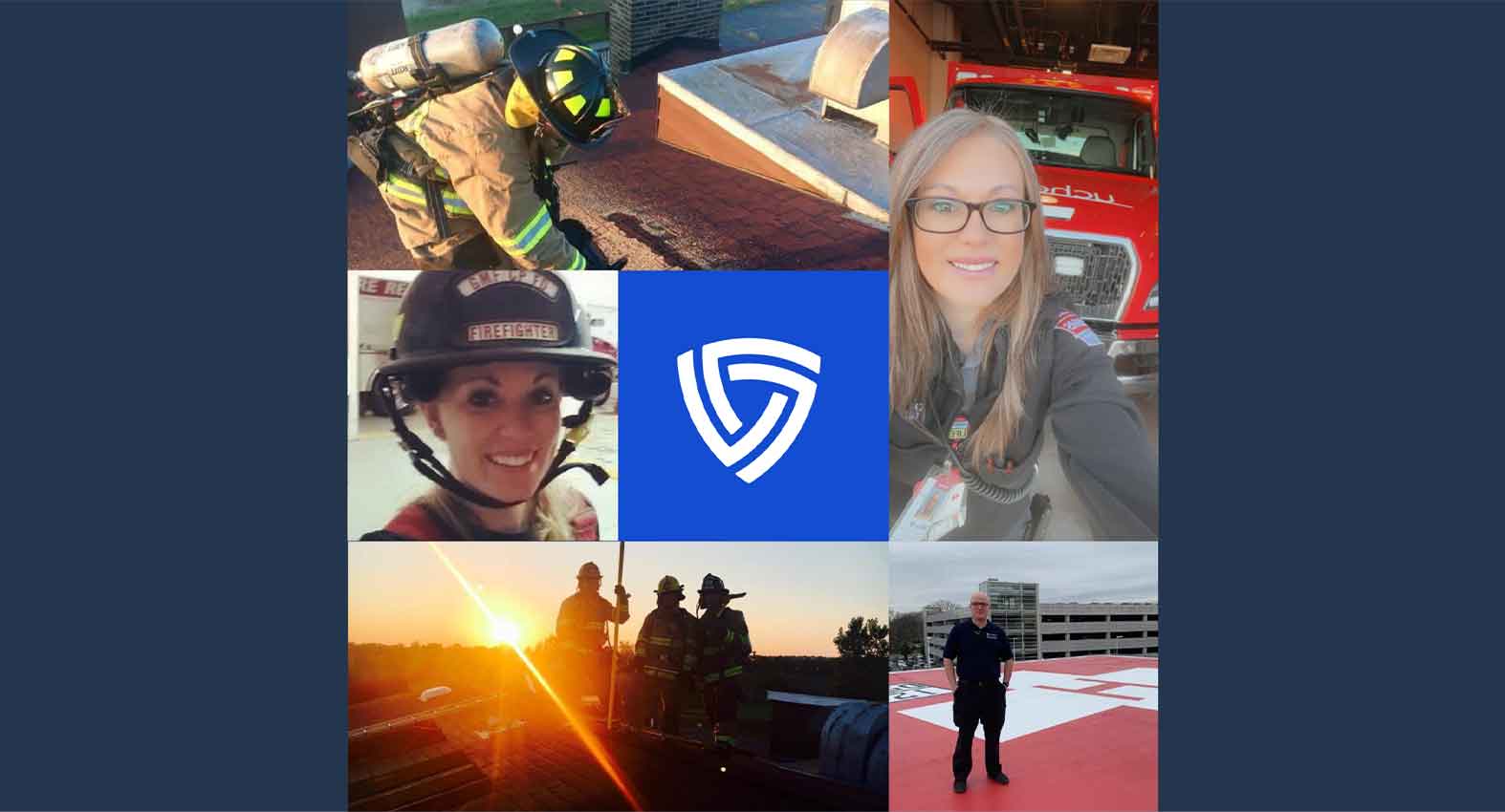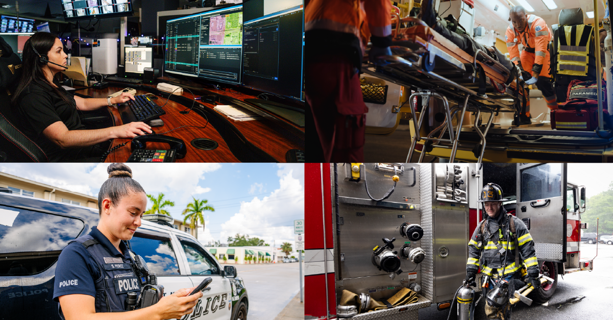
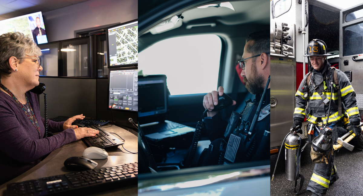
As a product designer at Mark43, I spend most of my day designing user interfaces that dispatchers, call takers, and first responders interact with. But our Computer Aided Dispatch (CAD) software is just one part of an officer’s suite of tools. Rather than thinking of our CAD system in isolation, we do as much field research as we can to understand the context of our end users’ environment. Pairing this research with our team’s design expertise enables us to develop a powerful CAD system that prioritizes first responders’ speed and safety.
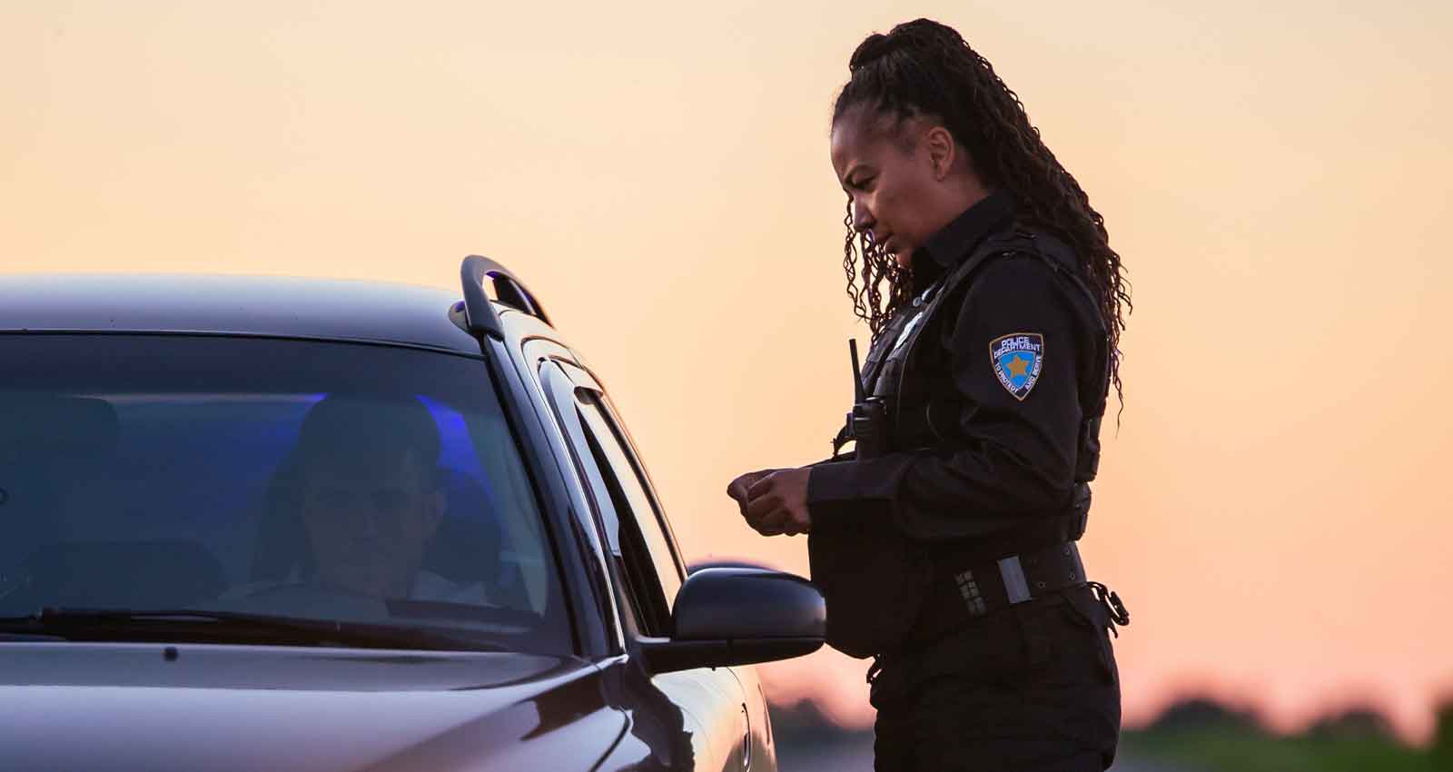
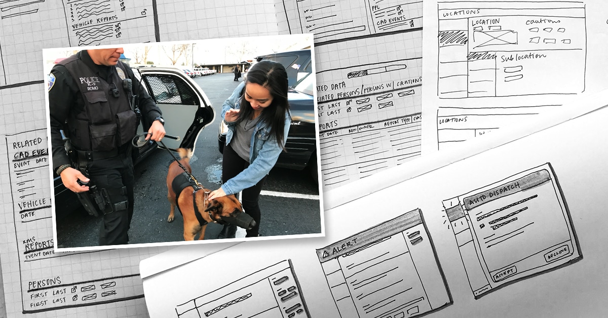
Our research typically includes interviewing stakeholders, getting feedback on prototypes, and shadowing end users. In order to design the first responder view of our CAD application, this meant going on a ride-along with a police officer. Spending the day on patrol led to a few unexpected observations that became valuable insights for our product design:
Critical information is hidden in plain sight
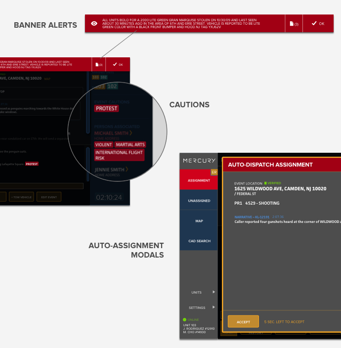
The first thing I noticed was that patrolling involves a lot of multitasking. Officers have to balance driving, listening to their police radio, observing their surroundings, and occasionally checking the in-car computers for updates. Most traditional CAD systems don’t handle information hierarchy well — most of the information is in the same size and color. This means that every time an officer glances at their screen they waste time trying to find what’s important because everything looks the same. Additionally, if an alert for a high priority emergency isn’t distinguishable from lower priority incidents, the officer may notice it too late, or not at all.
Informative, attention-grabbing alerts are key to an officer’s safety and productivity. To differentiate alerts from the rest of our CAD system, we holistically planned out our application’s color palette. We reserved bright colors and flashing animations for high priority emergencies.
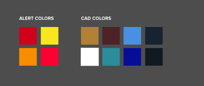
Aside from making alerts more visually prominent, our team created a visual system that pairs the most severe updates with the most attention-grabbing designs. We analyzed each type of alert an officer could receive and categorized them by severity and priority. Using basic design principles like scale and contrast, we found a way to effectively communicate urgency.
Notifications don’t break through the noise
Something that we take for granted is our mind’s ability to filter out noise. When I stopped to pay attention, I became aware of how much background sound was in the officer’s environment during the ride-along: the rumble of the car’s engine, the crackle of the police radio, and the noise of the street outside. Sitting in a police car allowed me to understand the soundscape that the audio alerts we design into our system would have to compete with.
Most legacy CAD systems don’t utilize sound effectively and often overuse sound effects. Sometimes the same sound is used for various types of feedback, making it meaningless to users. Consequently, many officers spend too much time turning to look at their screens, or worse end up muting their computers altogether due to annoyance.
We use sounds so officers can maintain awareness without having to look at their screens as much. After hearing the soundscape of a police car, we decided to focus on sound duration and hertz frequency to successfully communicate a message. Audio alerts should be at least one second long, so the user has time to process that the system has played a sound and then interpret the meaning of that sound. Anything shorter than that should be reserved for feedback triggered by an action the user has taken, since they’re already focused on the screen.
For a newly dispatched assignment, we chose a sound effect that sounds “electronic” with a mid to high hertz frequency range so that it would stand out from natural noises in the environment. We also considered that the sound effect should not sound overtly alarming or threatening.
New Assignment Alert
We took those same principles and added another layer for an urgent auto-dispatch assignment, such as a report of gunshots triggered by ShotSpotter. The system polls the units closest to the location so we chose an alert sound with a regular interval and looping quality, similar to the ping of a radar.
Urgent Auto-Dispatch Alert
Sound, when used thoughtfully and in moderation, adds another dimension to the software tools helping users maintain situational awareness.
Clicks aren’t quick
During the ride along, I also noticed simple actions that required a mouse were especially cumbersome in a police car. Driving while trying to precisely move a cursor to hit a small button requires a lot of dexterity. Some first responders have touch screens in their cars, but these still require a significant amount of focus to find the button on screen and tap it.
Keyboard shortcuts, on the other hand, are convenient because users can locate a button by feeling for it, rather than relying only on their sight. Over time they can build muscle memory, making these actions even faster.
We designed keyboard shortcuts to speed up the most common workflows. We simplified actions that take three steps with a mouse to one step with a function key. While this may seem like a small change, it adds up to a lot of time saved for our users since they execute these actions multiple times a day.
Going on research trips such as this ride-along serve as important reminders that there’s no substitute for going out in the field. It helped me relate to our users as real people rather than abstract users, which is the key to designing software that’s user-centered and intuitive.