


Why is accessibility important?
Designing for accessibility for the visually impaired improves the usability for everyone that uses our product. The Mark43 platform is a mission-critical emergency response application and our users are often fit, healthy, and are not likely to have limited vision. However, they often suffer from poor lighting, bad monitors, eye strain, long hours, and other distractions that contribute to reduced vision or clarity. Because of this array of environmental factors, designers at Mark43 carefully choose colors in our design system in order to optimize the safety and usability of our products. We go as far as to make this one of our core design principles, “#06 Design for real-life conditions.” In addition to following color accessibility standards set by the Web Content Accessibility Guidelines (WCAG), designers at Mark43 have many tools to make sure our products are accessible and usable.
WCAG 2.0 Standards
WCAG 2.0 is a set of standards widely seen as the international authority on digital accessibility. It’s broken up into four guiding principles, the first being perceivability. Perceivability is key in making sure users can comfortably use a product. The following is an excerpt from the WCAG guidelines:
Guideline 1.4: Distinguishable
1.4.1 Use of Color: Color is not used as the only visual means of conveying information, indicating an action, prompting a response, or distinguishing a visual element.
1.4.3 Contrast (Minimum): The visual presentation of text and images of text has a contrast ratio of at least 4.5:1, except for the following: (Level AA)
- Large Text: Large-scale text and images of large-scale text have a contrast ratio of at least 3:1
- Incidental: Text or images of text that are part of an inactive user interface component, that are pure decoration, that are not visible to anyone, or that are part of a picture that contains significant other visual content, have no contrast requirement.
- Logotypes: Text that is part of a logo or brand name has no minimum contrast requirement.
1.4.6 Contrast (Enhanced): The visual presentation of text and images of text has a contrast ratio of at least 7:1, except for the following: (Level AAA)
- Large Text: Large-scale text and images of large-scale text have a contrast ratio of at least 4.5:1;
- Incidental: Text or images of text that are part of an inactive user interface component, that are pure decoration, that are not visible to anyone, or that are part of a picture that contains significant other visual content, have no contrast requirement.
- Logotypes: Text that is part of a logo or brand name has no minimum contrast requirement.
Because contrast is so important in achieving perceivability, the only references to choosing color in WCAG are recommendations for choosing color combinations with high contrast, as stated in guidelines 1.4.3 and 1.4.6. Contrast can be measured, and these are the recommended measurements that WCAG suggests for contrast between text and its background element:
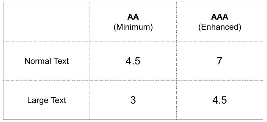
WCAG 2.0 contrast guidelines for text
Designers at Mark43 use plug-ins and other tools to examine how our components stack up and how our product might appear to those with different types of colorblindness. This is an important part of our design process, especially when editing our design system color theme, or creating new themes within our products. Our design team uses the Stark Plugin for Sketch to regularly check our designs and make sure we are falling within WCAG compliance. With it, we can also simulate different spectrums of color blindness to make sure our designs are suitable.
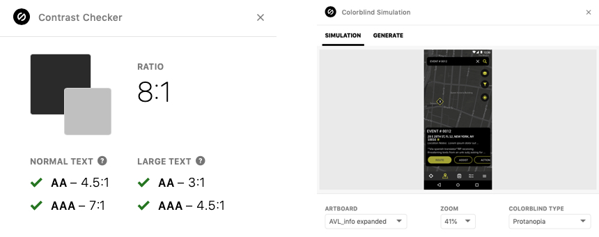
The Stark plug-in checks against WCAG 2.0 contrast compliance and simulates types of colorblindness all within our design software.
Other tools such as the Eight Shapes Contrast Grid lets you test text and surface colors against each other to measure contrast at a larger scale, as seen in the image below. This site also allows you to insert a code snippet of the chart into your company’s design system platform so that anyone building the product can see your color theme and its accessibility. This has been extremely useful to me as a means to test a large set of colors at once. I have been using it to guide me in iterating our existing color themes as I push them to be more accessible and more clearly defined across products.
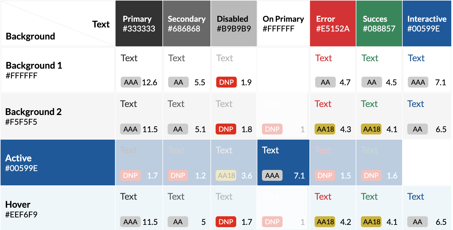
Test of a color theme’s text colors against surface colors.
Other Avenues of Perceivability
WCAG is one way to measure contrast, but it doesn’t always map to human perception. WCAG does not take context or color use into account. When designing for our color themes and design system, designers at Mark43 use these guidelines in addition to other tools to make sure users of all abilities and in any environment can use our products.
Additional Tools
Although color and contrast are powerful tools for perceivability, they are not the only tools available when working with visual elements on a page. In fact, WCAG 2.0: 1.4.1 states that color cannot be used as the sole distinguisher of a visual element. In addition to color, we use contrast, font style, spacing, alignment, size, placement, animation, time, and more to indicate an action or distinguish visual elements. In addition to color, this example below uses heavy text with an underline to indicate a call to action. Because of this, the actions are distinguishable even when the element of color is removed.
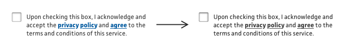
The text link is indicated with color, bold styling, and underline.
In our Computer Aided Dispatch (CAD) app, we use these elements to make our dense interface more usable. Location indicators use shape in addition to color to distinguish between different types of indicators and our text links use case, weight, color, and icons to call out an action.
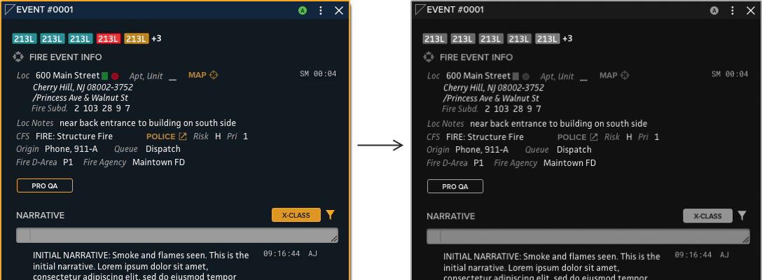
Fire agency event panel in the Computer Aided Dispatch (CAD) App in color (left) and B&W (right).
User Research and Testing
Testing our designs and products with users is an integral part of adhering to accessibility best practices. Not only do we test designs on spare devices and monitors that mimic our user’s environment and hardware, but we also test new designs with users to get their feedback on color accessibility, among other usability checks.
Light Mode and Dark Mode Contexts
When designing our products, we must take into account the environment in which our users are using our software. Dispatchers in dark rooms looking at bright screens can get digital eye strain; officers in their patrol car at night with a bright screen can get road blindness and expose them by lighting up the inside of their vehicle. Because of this, we design for the color context which is suited to our users. Our Computer Aided Dispatch (CAD) was designed with a dark theme for dispatchers and first responders in the field:
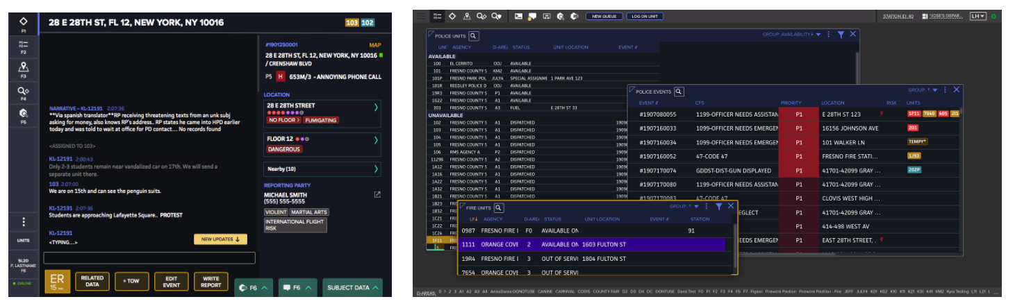
CAD First Responder (left) and CAD Dispatch (right)
Our Records Management Software (RMS) allows users to choose between light and dark contexts to suit their preference and environment. Our RMS was initially designed and built with a light color theme, however, we heard feedback from users that a dark theme was needed.
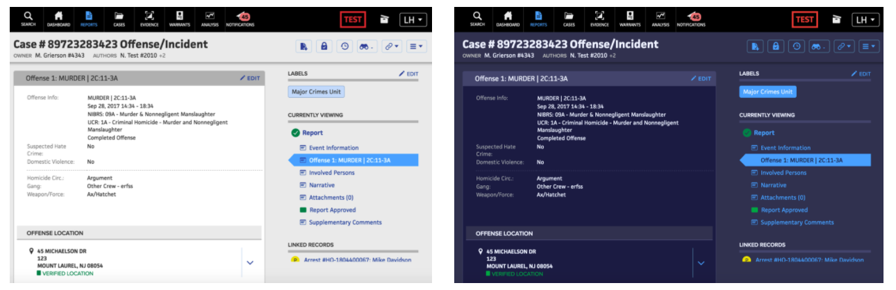
RMS light theme (left) and dark theme (right)
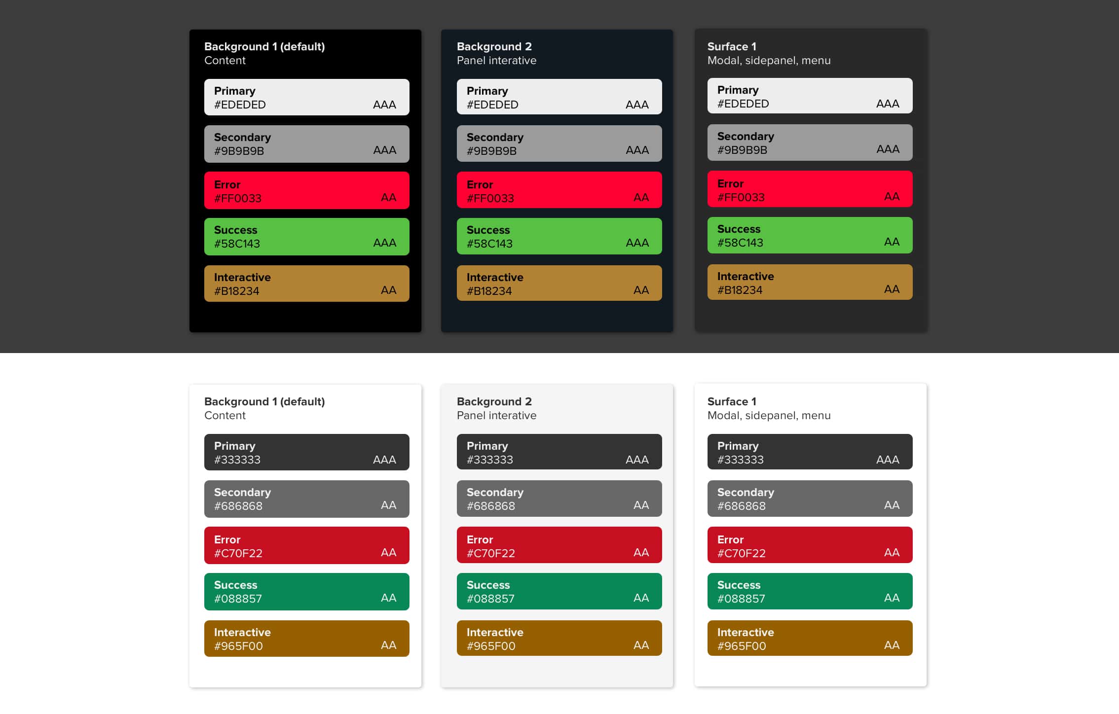
Color Accessibility and the Design System
We know that our users have workflows that span multiple products and often switch back and forth between products in a given workflow. However, as you can see in the images above, each of our products currently has separate color themes and design systems. Although each product’s color theming aims to meet accessibility practices, slight differences between the design systems can cause confusion with our users. Additionally, since our RMS was first designed in a light context and our CAD in a dark context, we know that the usability and UI of those primary color themes are strongest in the products it was primarily designed for. To improve the color accessibility and usability of all of our color themes, we are currently re-defining our design system color theming. Doing so will pull the strongest aspects of the color theme and accessibility from our dark and light contexts to make theming more consistent across apps while further improving our usability and accessibility for users who are working across products.